A brand that brings souls together.
As a marketing agency, we were entrusted with the task of creating a new brand, from scratch, starting with naming, logo, colors, vision, mission and storytelling. To understand the core
values of the brand – we had to understand the vision of the owners and the values they wanted to
offer to consumers.
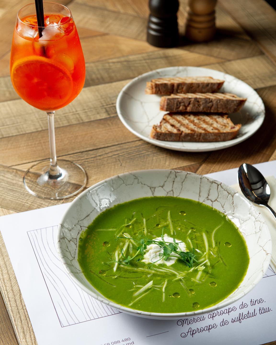
APROAPE – the DNA of tasty dishes and family atmosphere
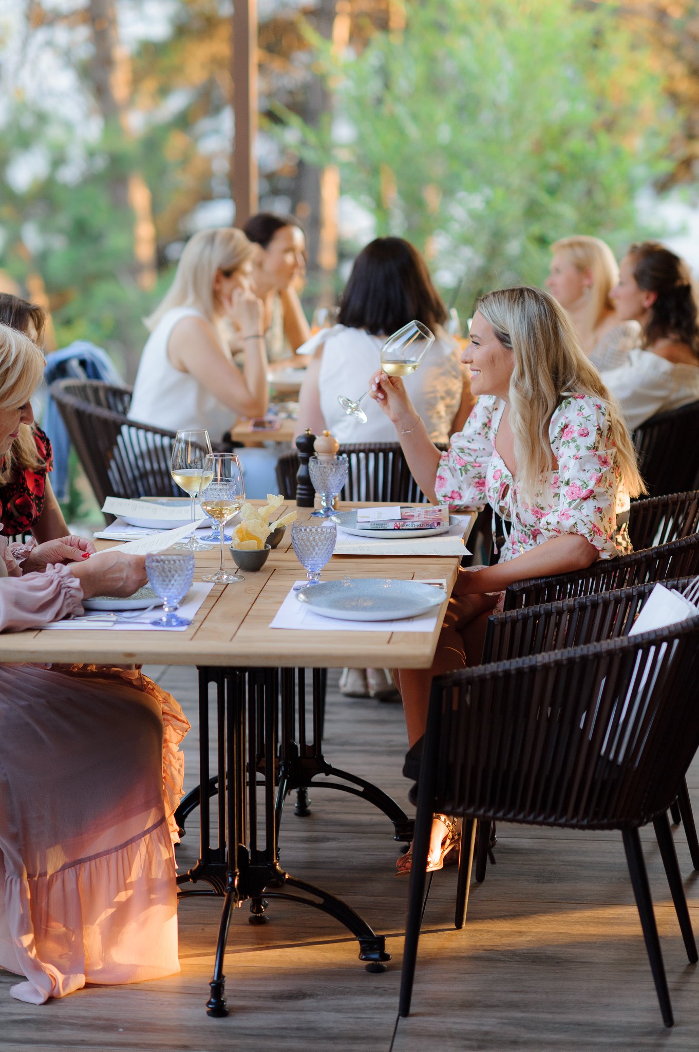
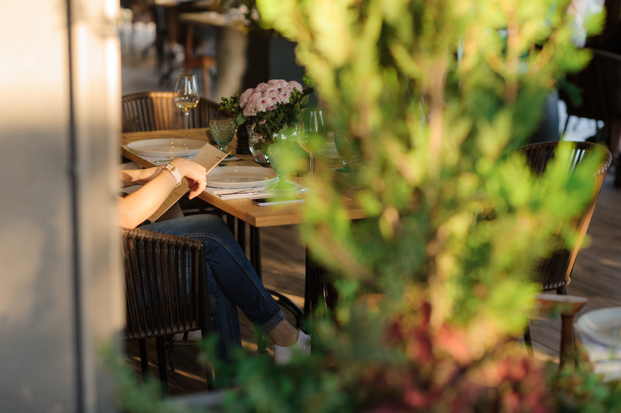
Each of us needs a favorite place to escape. A place where the family gathers and the affairs of the city remain somewhere far away. A place where the minutes stretch in a special way, without haste and you begin to truly believe that dreams come true.
To launch APROAPE as a brand that reflects the desire for new culinary experiences and family
atmosphere, we started looking for that word to express these values.
Through brainstorming, hundreds of ideas, sophisticated words, finally came the idea – the warm word that perfectly reflects the soul of the restaurant – the word APROAPE.
Why APROAPE?
Because this is the word that Brings, that Unites, no matter where in the corner of the world we are. Nothing compares to the words: Close to your loved ones, Close to family and friends, Close to what is dearest to you on earth.
The name of the restaurant was chosen as a promise of continuous development of the creative culinary concept and the creation of new experiences for guests with the aim: to tell a story about this brand.
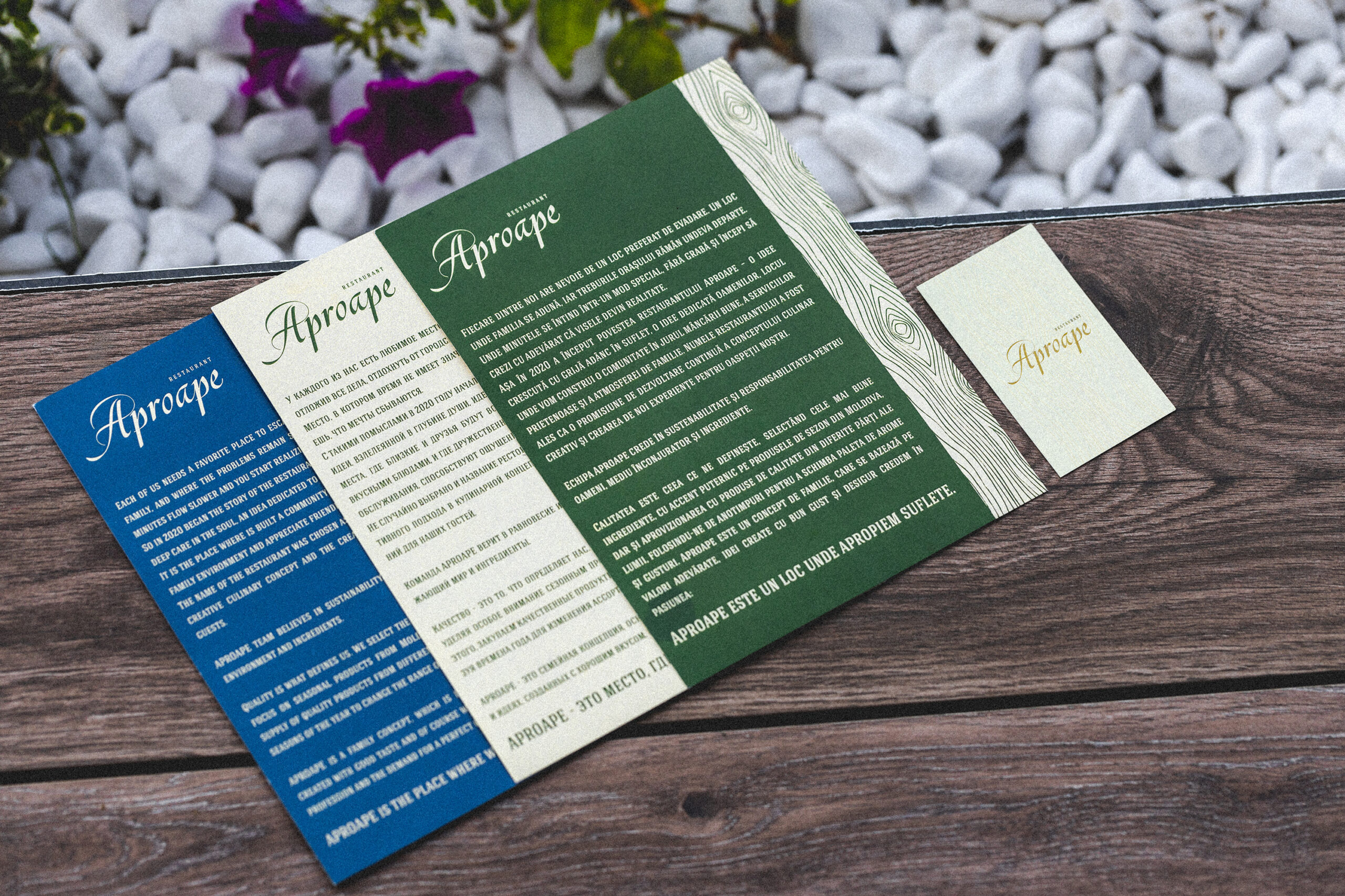
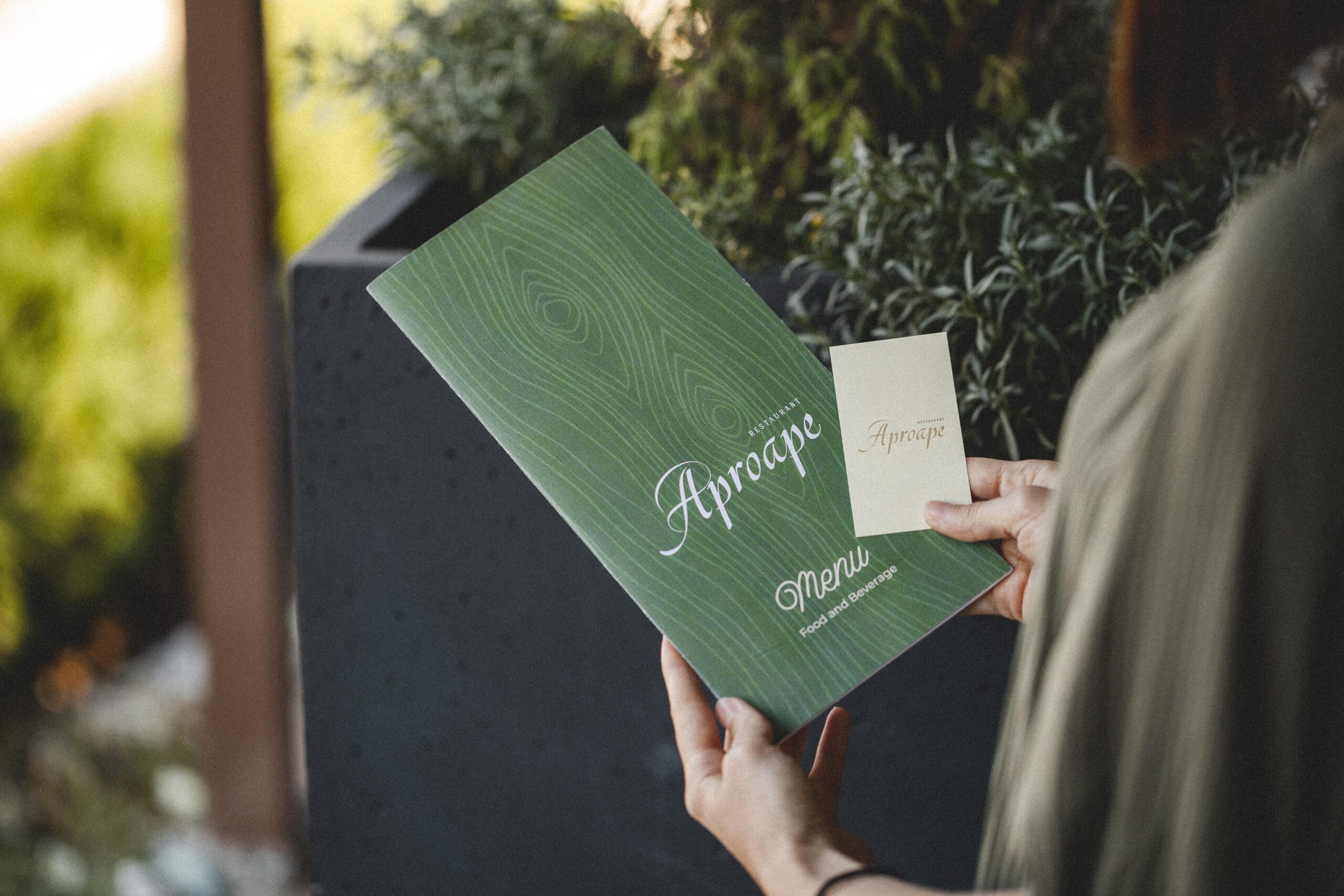
Over 100 variations and 50 shades of colors
The logo is the main ambassador of any brand, and a restaurant is no exception.
The logo design followed a similar naming thought process as naming, with a variety of sketches and exploratory concepts. Among a lot of designs, concepts, fonts, the word APROAPE became the starting point for creating the logo.
Thus, a word mark logo (text logo) was created, a font that renders the friendly, warm, familiar character of the restaurant.
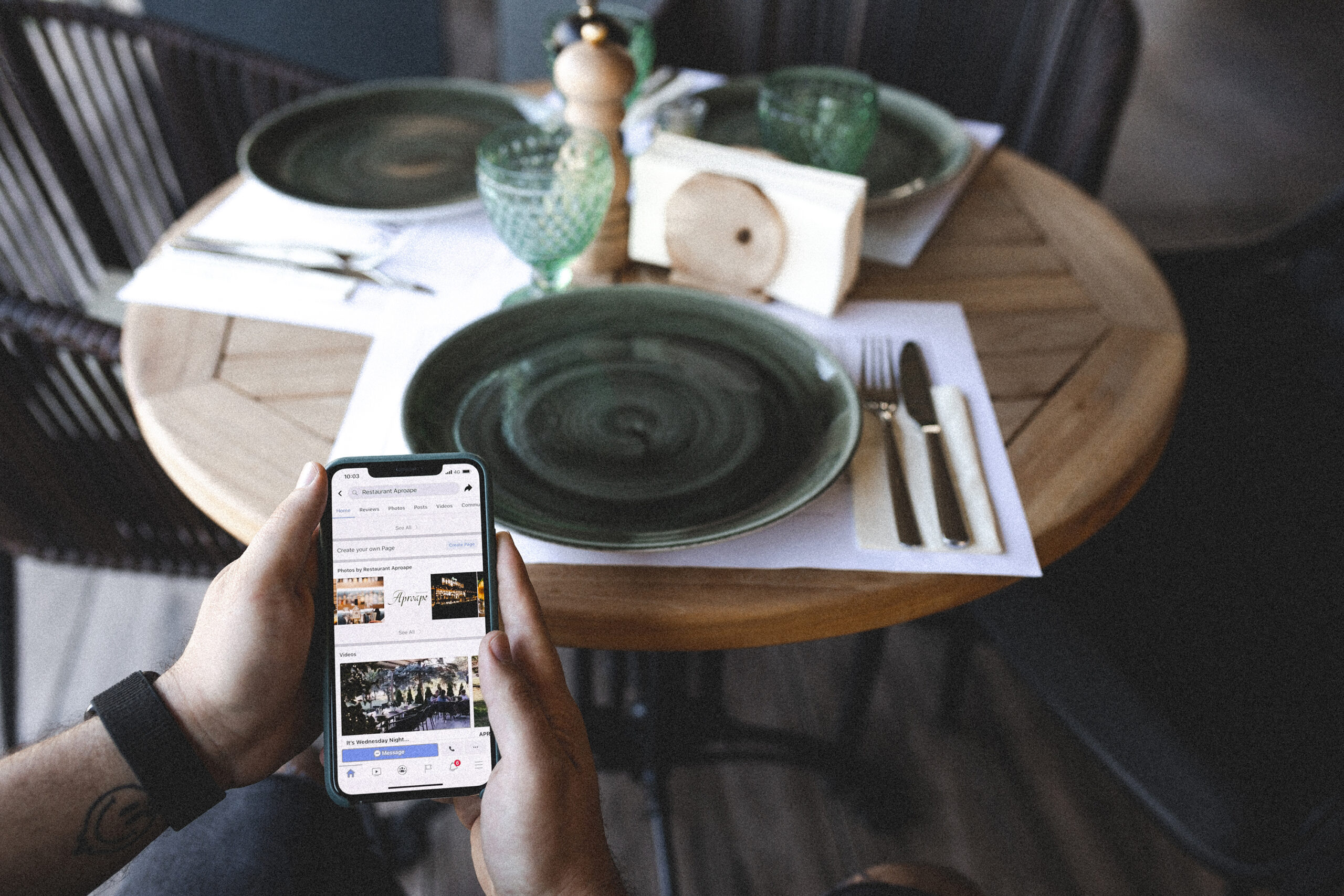
We also designed the restaurant menu with the logo on it. The logo made its place on all stationery, such as: business cards, discount cards, gift boxes, etc.
Avoiding the traditional color palette of the spectrum, used by almost any other restaurant, we chose for APROAPE the combination of olive green and cream beige. Beige shades provide an atmosphere of safety, tranquility and balance, help create a warm and welcoming room, and green – reminds of nature, describes harmony, freshness, comfort and awakens the appetite.
From a pencil sketch to a
Traditional restaurant
The flexibility and transparency of the work process within the team, as well as the collaboration with the restaurant owners led to an incredible finished product, to the creation of a solid brand with a great history.


A branding closer to the heart with each bite
Every business has something to tell, and APROAPE is no exception.
The story of the brand APROAPE aims to help the public find personal and emotional connections with this brand, to keep the brand in the mind and heart of the customer.
The emphasis was on emotions and not boring figures, to allow the public to know the brand on a more personal level, to retain them. This loyalty makes guests come back again and again, because the restaurant is more than just a restaurant, it is a place where people invest emotionally.

…because every word can tell a story